Escape
In this game, the little boy loses his memory and found himself in a new bedroom. After doing some tasks and chatting with a dog and a princess, he wakes up, finding himself in hospital. Everything is a dream.
This game is for myself. I used to be frustrating and struggling while having trouble doing things. At that time, i really enjoyed being with my little dog and playing my favorite games, Super Mario, Pokemon Go. It would make me relaxed and forget all the annoying stuffs.

Comments
Log in with itch.io to leave a comment.
Prompt 4: Describe how text is used.
When I start to play it, the game’s name “Escape” showed up. It makes me wonder like what the avatar should escape from, and it motivates the player to explore what is really going on in this game. And the flashing bubble next to the avatar gives a basic context, but not enough for the players to deduce the pilot. The dialogues for the keys and doors are designed to require a key to open the door, because I tried to open the door first without the key and it failed.
The next room is the same idea with the first room, but it changes the key to a dog. Since I did not talk to the dog and just go straight to the bones, I am actually curious about the reasons why I pick the bones up. Without the dialogues of the bones, the players are confused about what to do with the items that they pick up, so it might be better to add some dialog to indicate that it is a bone. Therefore, the players can connect it with the dog and know its function,
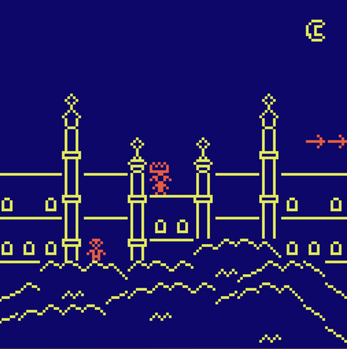
When I interact with the princess, I know what my goal is- to help the princess get her necklace. And the dialog with the dog after the avatar escapes from previous rooms makes me realize that those scenes that I have just been through are the places that I want to escape from, but it is not the end. After having the last dialog, we finally get to know the whole plot of the game, which I think is a small plot twist, because those scenes are just the memories and they help me to escape from the comma.
In this game, almost every room has a different setup of the tiles. For example, the square tiles of the first room are repetitive which gives me a sense of dizziness while entering the game. In my opinion, this dizziness also matches the storyline towards the end of the game (where the character was actually in coma). In addition, the maze also brought lots of attention to me. The tiles in the maze are straight-forward simple: the tiles are filled in with either blank or in the shade of purple. The choice of tiles in the maze room help players to easily identify the path, and present a puzzle that challenges players yet still solvable. Another example of tile design in this game would be the beach room. The designer uses the room as a canvas in which each tile is a part of a larger image. Also, the representation of a beach is abstract: dots represent the sand and animated curves represent the waves. One thing I observed is that the style of the tiles combination in rooms are interspersed. Some rooms look simple (hospital bed/the maze) while some other rooms look more complex (princess castle/the beach). It is interesting to see different styles of representation are included in this game, and it helps to set players on a balanced level(not too easy and not too challenging). One thing that the designer might be fighting with Bitsy is the transition exits. The designer chooses to use animated arrows or a door tile to direct players to exit the current room. I do see in some rooms (such as the beach) players do need a direction to proceed to the next room, but the arrow tiles sometimes take some attention away from the game itself.